Hi everyone! Claudia here. I am so excited to share one of my favorite techniques, when scrapbooking digital, with you! I have been scrapbooking digitally for a couple of years now, and I absolutely love it! I am a clean and simple kind of scrappers, so I get really excited when I learn new techniques, and this was definitely one I was doing the happy dance with. I call this technique... Fun with Fonts!
Ready to get started? Here is my layout. That is my beautiful sister and her fiancé. I took these pictures when they were recently engaged last summer. I used Samantha's Tea Party Tomato papers; I can't get enough of these colors!
As you can see, my title looks kind of blah. It doesn't really stand out within the layout. I am not great at journaling in my layouts, so I really need the title (and the photos, of course) to tell the story.

Ok, here we go, I have the layout and the paper I am going to use open in Photoshop Elements 9 for Mac.

Drag the digital paper on to the layout; make sure you have the text layer highlighted so the paper layer is right above it. The digital paper will cover the whole layout until you clip it to the layer below.

Now you are going to clip the two layers. Clipping masks is another one of my favorite techniques. It is so easy. Just highlight both layers, go to Layer > Create Clipping Mask. See how the font looks textured and different already?

Next, I like to merge the two layers together; it will make adding a style much easier, I think. Just highlight the two layers again, left click on your mouse, and click merge layers from the list.

I love adding strokes to my titles; gives it a sticker like feel, and really makes the font stand out. All you have to do is go to Edit > Stroke (outline) Selection, and this box will pop up. Here I select a color (using the eye dropper) from the papers in the layout so the stroke matches nicely. I like to use a width of 8px; not too thin, not too thick.

Click ok, and presto!

Now the title needs a little depth, don't you think? Go to Layers > Layer Styles > Style Settings.

Here are the settings I like to use for the drop shadow:
Lighting angle: 45 degrees
Size: 7px
Distance: 10px
Opacity: 70%
I also set the color of the shadow to match one of the darker colors in my layout (the default is black, and it doesn't always work); in this case I used the eye dropper to select a brown tone from the photo on the left.

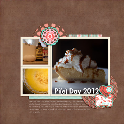
Here is my final layout.

What do you think? Easy peasy, right? I hope you will try it too. It really does add so much life to just about any font.
Until next time.
Lots of happy hugs,