
Samantha has this fun new Par-tay Font [#57535] in the Silhouette Online Store and much like the image states, it welds well!
Have you welded? Welding makes applying text to your projects easier, especially for vinyl projects. In addition to welding, let me walk you through some other fun things you can do with fonts to make your projects more fun.
 |
| New Par-tay Font from Samantha Walker |
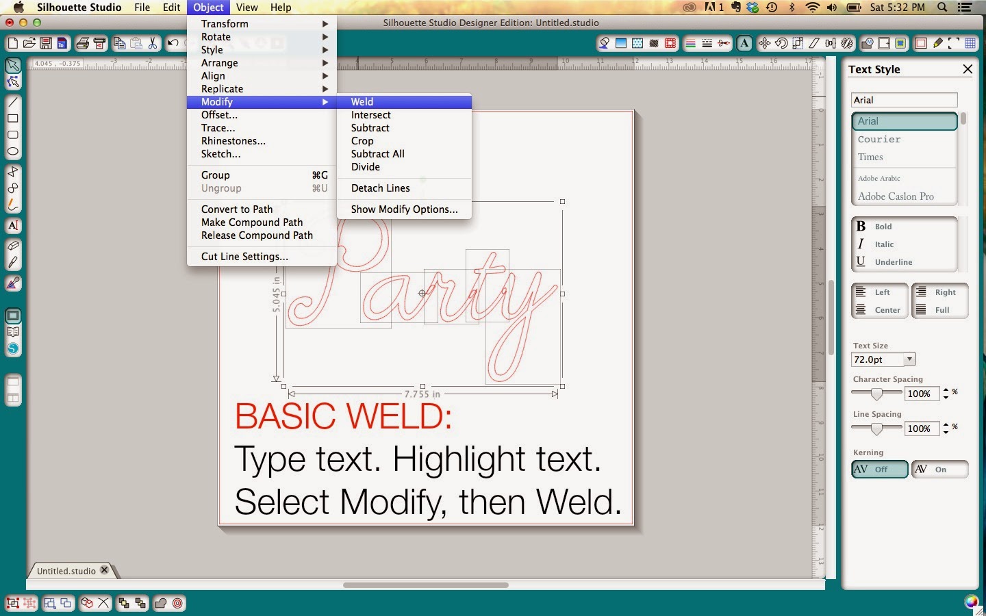
For a Basic Weld, type your word, select the text and choose OBJECT then MODIFY and select WELD just as it's shown below. Any overlapping letters will then be combined.
What if you want to weld your words and make them shaped, for example the word Rainbow over an actual rainbow?
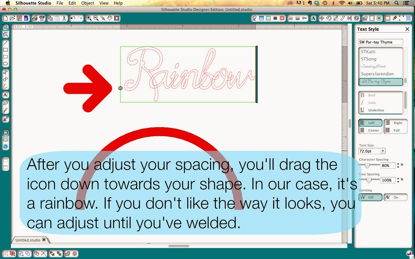
Since you're curving your text, you need to space the letters a little closer together. Adjust your character spacing. When you click on the little A to type your text, the Text Style menu opens. The arrow below is pointing to the Character Spacing option. I found 80% to work well for the Par-Tay font. Sometimes, a little trial and error is necessary.

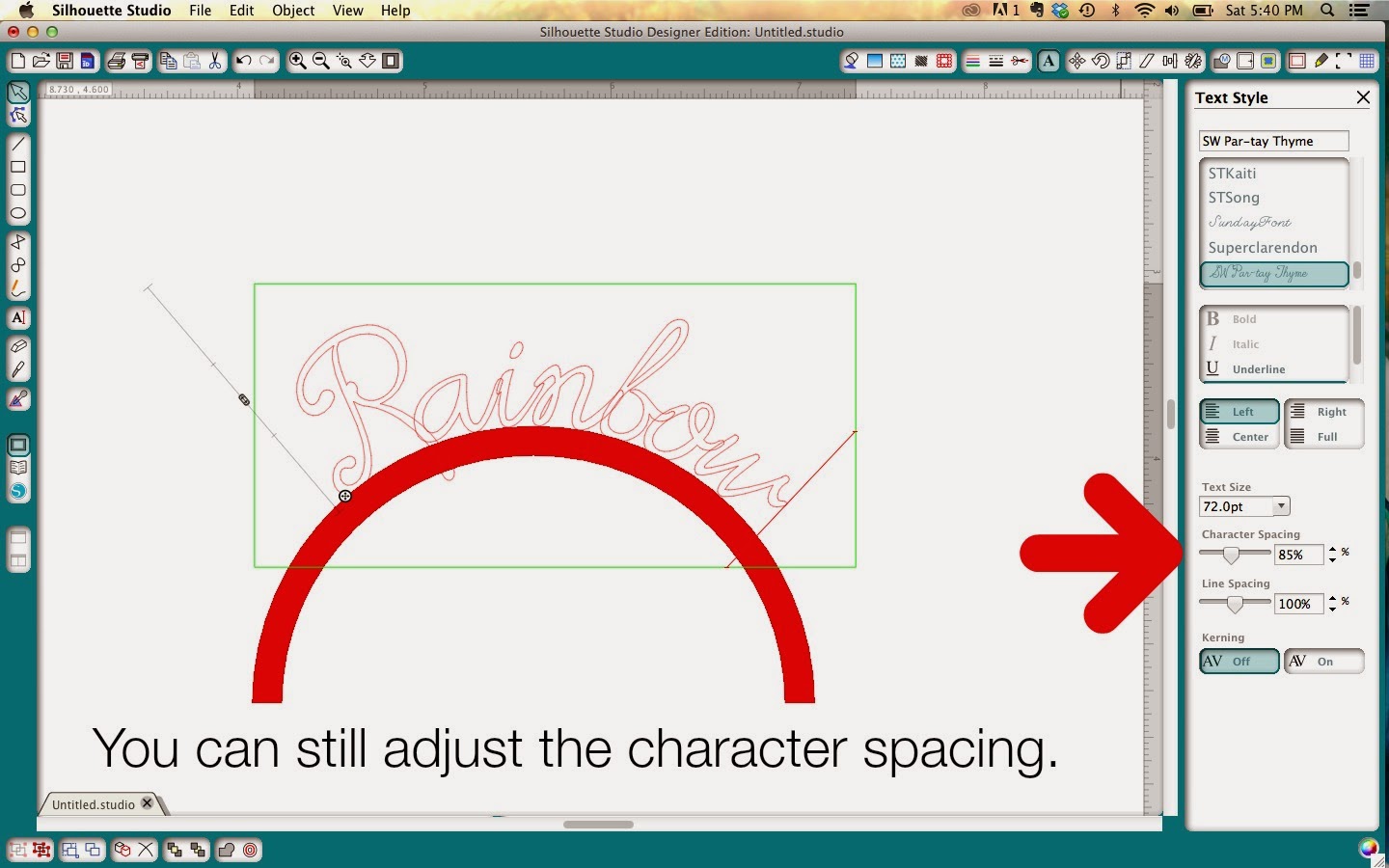
If you adjust and then curve your text and it's too far apart, or even too crowded... you can still adjust the Character Spacing until it's welded.
To curve the text, you'll click on the little round circle (shown above - on the lower left side of the box of text). Pull it down to the object until it curves. You can drag it along and place it wherever you like. This works on any shape, and can even be used inside the shape - just pull past the shape.
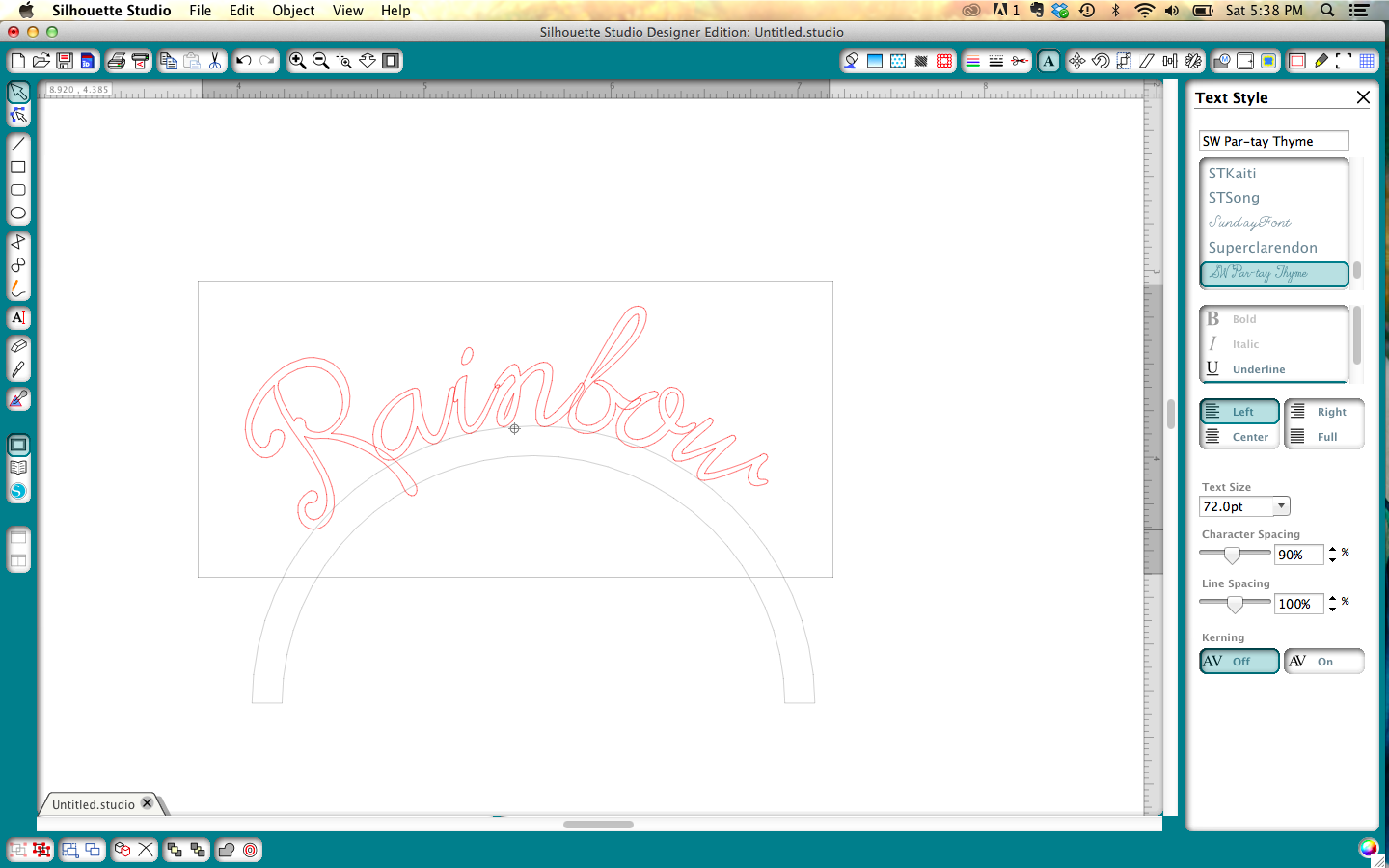
 Voila, you've curved some text. Note, I've turned this upper layer of the rainbow red just so you can see better.
Now don't forget to weld! (not shown)
If you're still with me, and you've mastered all that, let me walk you through some of your other text options.
There's a little icon that looks like a forward slash ... just like this character - /
This tool opens the SHEAR menu and lets you adjust the shear horizontally or vertically, also known as kerning.
Each picture shows you what that option would look like.
HORIZONTAL SHEAR PLUS 30º

HORIZONTAL SHEAR MINUS 30º

VERTICAL SHEER PLUS 30º

VERTICAL SHEER MINUS 30º

Obviously you can kern more or less, using any of the tools, and you can even customize. You can still curve (that is, shape) kerned text as well.
I really like to customize text and make it work for my projects.
I'll share one more thing. Some text is just too thin, and maybe you're frustrated because you like it but you can't cut it out of certain materials. Lavenderia Script was just like this for me, but I thought it was so pretty.
Note: If you want to shape your thin text, you will want to shape first and then proceed with the offsetting. You'd also follow this procedure to mat words.
I offset the word Merry to .07. You can easily do this with the Par-tay font as well.

Thanks for joining me today.
Happy TEXTING!


No comments:
Thanks for taking the time to leave a comment! Without your readership, I wouldn't be doing a blog.
My blog is supported by sponsors and affiliates. If you decide to make a purchase through my affiliate links, I am paid a small commission for it. This doesn’t cost you anything additional. These commissions help to keep the rest of my content free, and allow me to blog more often.
From time to time I make recommendations of products that I love to use, or products that I have designed. Occasionally, manufacturers send me products to play with. They have not obligated me to show them on my blog or review them. I only make positive remarks about those things that I truly love and enjoy to use. Everyone's personal experience with various products may be different, as we all use things in different ways. I am not compensated for these remarks, and merely pass on my opinion to you as a reader. I hope you find my opinions valuable.
Thank you for supporting my blog!